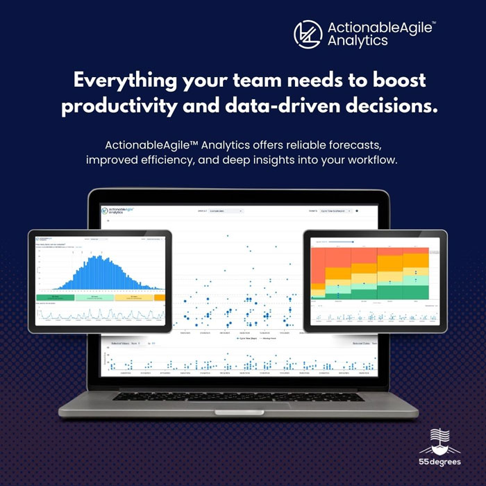
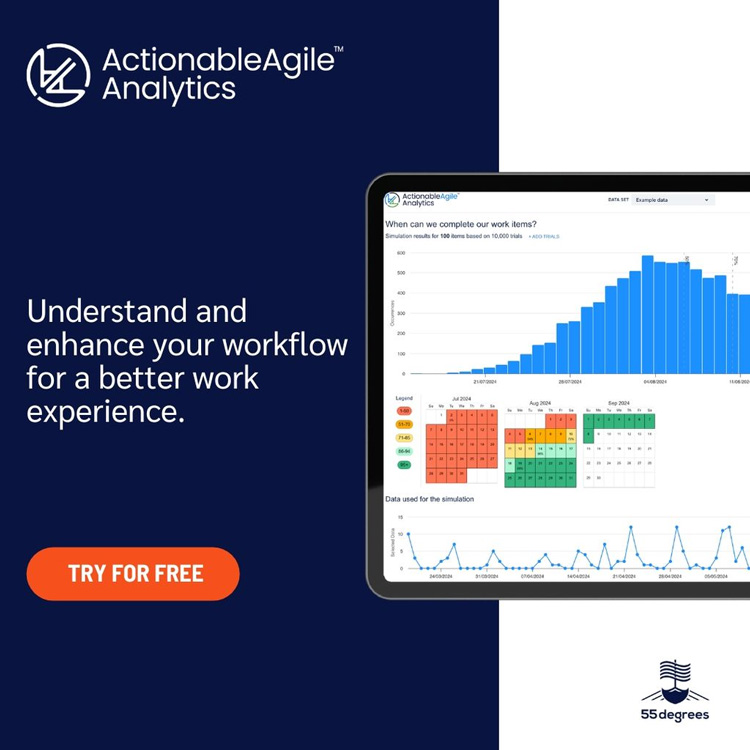
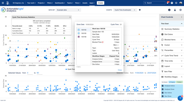
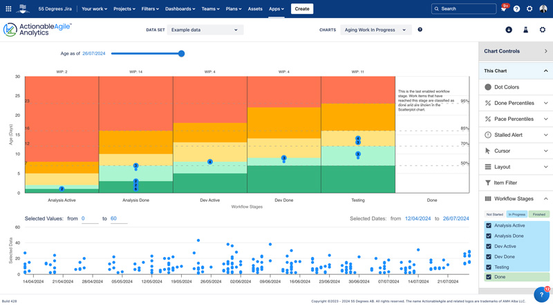
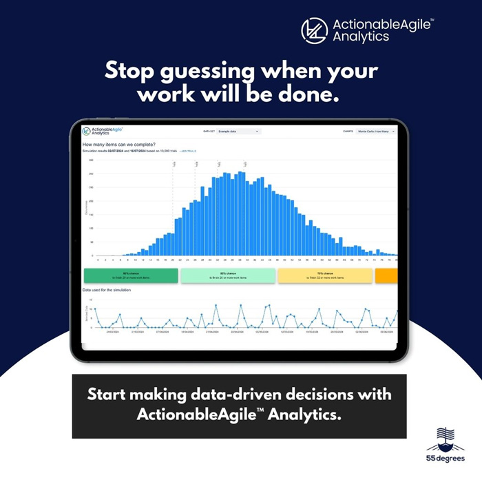
55 Degrees offers a streamlined perspective on your projects. By providing a clear and concise visualization of your workload, these apps empowers teams to prioritize effectively and reduce project overload. With 55 Degrees, gain valuable insights into your project status, identify potential bottlenecks, and make data-driven decisions.

Step 1 of 6

ActionableAgile™️ Analytics for Jira

A suite of world-class charts and simulations that use flow metrics to help you understand how work really moves through your process.

That knowledge unlocks your ability to ask the right questions, drive meaningful improvement, and accurately forecast outcomes and their likelihoods despite the inherent uncertainty in our work.

Our users love the ability to securely share data sets while still respecting Jira's permissions. We make it easy for stakeholders to understand the data and trends.

Benefits:

  • Data-Driven Decision Making: Make informed decisions with the backing of comprehensive analytics and easily follow up on the outcomes.
  • Accelerate DevOps (& Beyond): Increase visibility and pace of work between development and operation teams (or any other areas of your process!)
  • Instant & continuous forecasting: Quickly provide updated answers to "When will it be done?” or “How much can we do?”
Step 2 of 6

How long does it REALLY take to complete work?

The cycle time scatterplot chart shows you the total elapsed time it took for individual items to move from one point of your workflow to another - usually from start to finish. By looking at this at scale you can create service level expectations (SLEs) that you can use to guide future decisions and commitments.

This chart takes you out of manual spreadsheets and provides a quantifiable way to measure success in real-time rather than relying on a 'gut feel' and green sticky notes. 

Benefits:

  • Find the cycle time of an individual piece of work.
  • Set realistic service level expectations using percentiles and probabilistic forecasting.
  • See if how your cycle times change over time with moving percentile lines.
Step 3 of 6

Unlike most charts, this one tells you information about work currently in progress. If you look at this chart frequently, perhaps at your daily meetings, you can manage your work so that it never gets older than it should.

This is a power-house metric. Introducing efforts to consistently avoid unnecessary aging of work items is almost guaranteed to result in better and more consistent cycle times -- in other words, improved predictability.

Benefits:

  • Meet SLA's with ease by identifying stale work.
  • Prevent bottlenecks: Use during daily check-ins to see issues in real time, allowing the team to get ahead of larger problems.
  • Improve throughput by focusing on finishing what's already started.
  • Improve the teams delivery predictability by finishing work items faster and more consistently.
Step 4 of 6

The "Monte Carlo: How Many" chart helps you answer the question "How many work items can we finish?" in a particular amount of time. 

Define a date range and our app will use your historical Throughput data to enable you to confidently make statements such as "There's an 85% chance that we can finish 15 items or more by June 1, 2025."

Revisit the simulation as time progresses to get an up-to-date forecast in seconds - avoiding nasty surprises.

Benefits:

  • Step away from manual forecasting sheets: Save hours each sprint, PI, or other timebox and calculate in seconds “How much can we finish by then?”
  • Gain a deeper understanding of your team's true capacity for work.
  • Strategically plan timelines based on team performance.
Step 5 of 6

Forecast Delivery Dates with Confidence Using Monte Carlo 'When' Chart Simulation!

The "Monte Carlo: When" chart helps you determine "When will it be done?" for a particular scope of work. 

Provide the amount of work left to complete and we will use your historical Throughput data to enable you to confidently make statements such as "There's an 85% chance this work will be done on or before June 1 of this year."

Revisit the simulation as time progresses to get an up-to-date forecast in seconds - avoiding nasty surprises.

Benefits:

  • Improved Risk Management: Provide a forecasted date to leadership and stakeholders alongside a likelihood that it will be met. Choose a date based on the tolerance for risk!
  • Become data-driven: Use real data to forecast completion dates. Avoid overly optimistic or pessimistic dates based on bias alone. No gut feels here.
  • Dynamic Scenario Planning: Teams can simulate different scenarios and their impacts on project timelines and budgets. This dynamic approach to planning allows for agile responses to changing conditions.
Step 6 of 6

Security is in our DNA

55 Degrees and ActionableAgile™ Analytics are Marketplace leaders in recognizing that security is one of the most important factors for our customers.

An important part of living up to our values is our commitment to data privacy and security throughout all aspects of our organization. We don't take a single step without ensuring we've taken all reasonable steps to protect your data and privacy.

We have a Trust Center available, hosted by Vanta, which allows you to see real-time lists of our monitored technical and operational measures and to access selected internal policies. To learn more visit www.55degrees.se/trust.

Benefits:

  • ISO 27001 Certified
  • SOC 2 Type II Compliant
  • GDPR Compliant
  • Atlassian Security Programs Certified